 "/>
"/>
 "/>
"/>

设计单位|森上建筑
项目类型|室内设计
项目地点|浙江,海宁

园丁工具博物馆 Gardener's Tool Museum
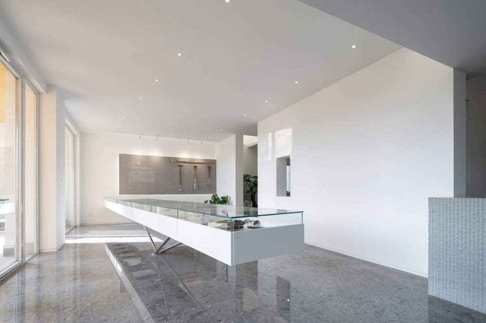
园丁工具博物馆集合了各时代各类型的园艺工具、机具以及各种文献资料,记录了中国、欧洲、日本等国家从上世纪至今园艺工具的发展历程与形式、材料上的变化与技术升级,详尽而有趣的展示并科普了相关园艺工具的一系列资料。
The Gardener Tools Museum collects various types of horticultural tools, equipment
, and literature from different eras, recording the development process, forms, material changes, and technological upgrades of horticultural tools in countries such as China, Europe, and Japan from the last century to the present. It provides a detailed and interesting exhibition and popularization of materials related to horticultural tools.
时间的布局
Layout of Time
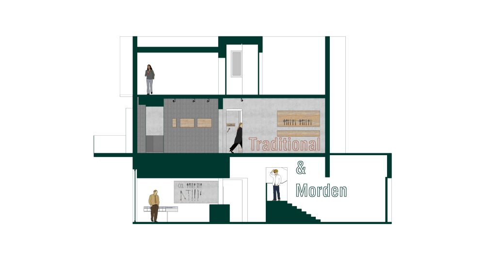
空间剖面 Spatial profile
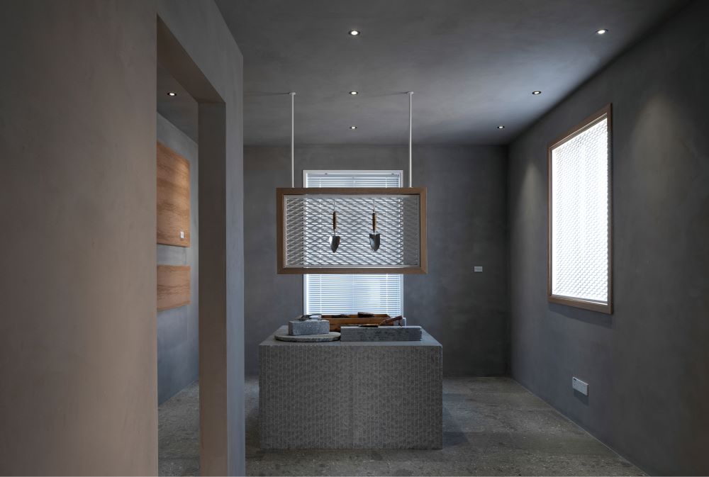
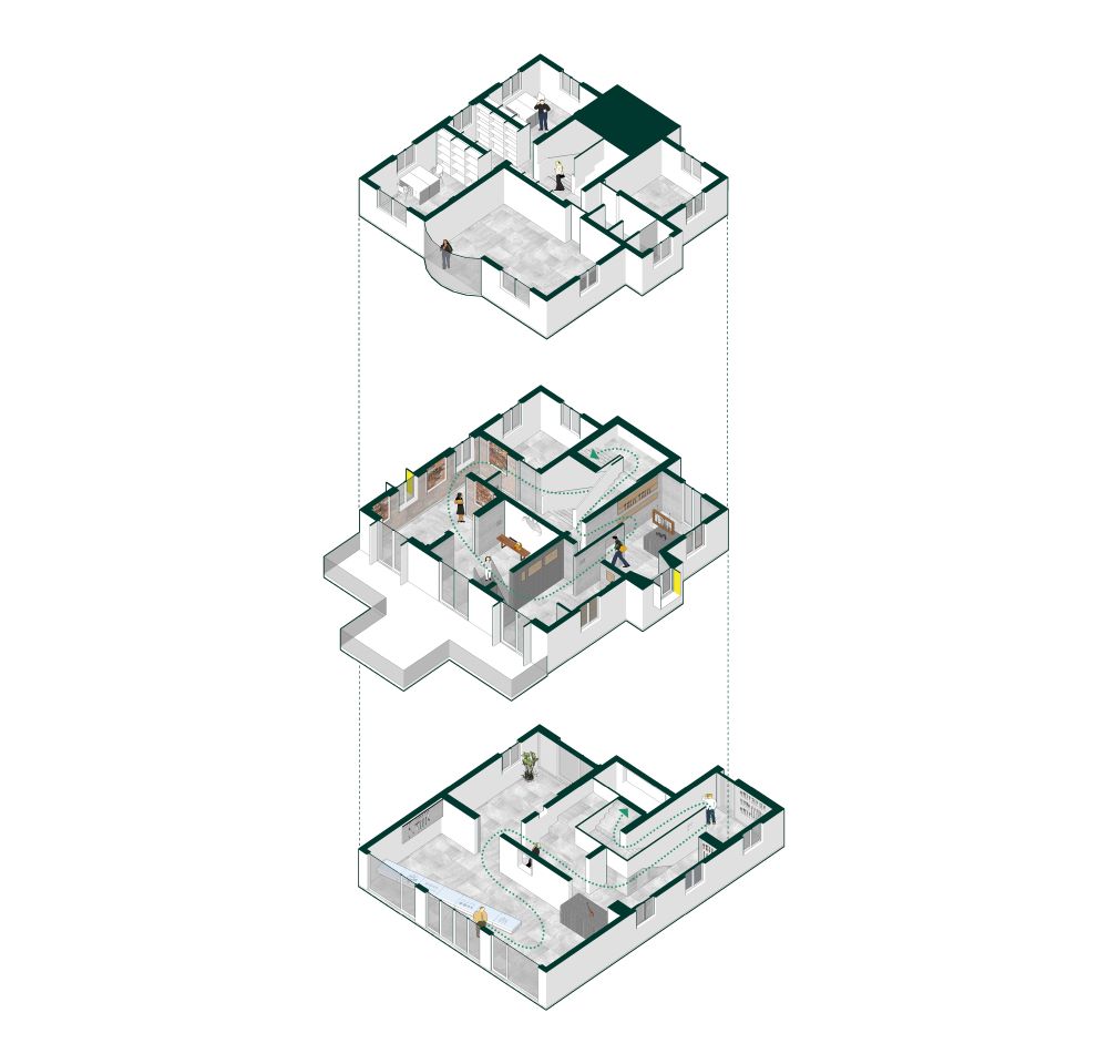
园艺博物馆位于虹越园艺社区中心,用于陈设并展示各品牌不同类别和领域的园艺工具与机具。展馆由三层的农民房改造而成,主要展示内容分层设置:一层为现代器具展区,二层为传统器具展区,三层作为资料室与管理部门使用。现代感的一层展厅由户外花园直接进入,营造的氛围衔接了建筑的周边环境与和今的现代生活气息;二层的传统展厅则与楼下形成截然不同的视觉反差,通过幽暗的基调、自然的材料与传统的元素来烘托具有园艺感的氛围;三层的资料区回归简洁的统一,仅以书架的形式划分空间。现代与传统空间的场景切换构成了展馆空间的时代反差,也为人们带来了契合各区主题的观展体验感。
The Horticultural Museum is located in the Hongyue Horticultural Community Center and is used to display gardening tools and equipment from various brands, categories, and fields. The exhibition hall is transformed from a three story farmer's house. The first floor is a modern equipment exhibition area, the second floor is a traditional equipment exhibition area, and the third floor is used as a reference room and management department. The modern first floor exhibition hall is directly accessed from the outdoor garden, creating an atmosphere that connects the surrounding environment of the building with the modern lifestyle; The traditional exhibition hall on the second floor creates a completely different visual contrast from the downstairs, using dark tones, natural materials, and traditional elements to create a horticultural atmosphere; The reference room on the third floor returns to a concise unity, dividing the space by bookshelves only. The scene transition between modern and traditional spaces creates a contrast of the times in the exhibition hall space, and also brings people a viewing experience that fits the themes of each district.

一层·现代展厅 First Floor · Modern Exhibition Hall
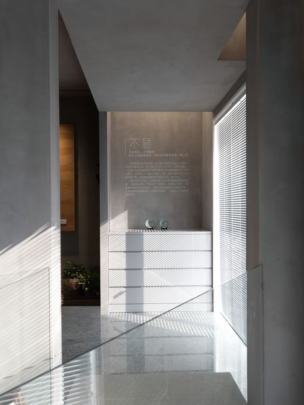
二层·传统展厅 Second Floor · Traditional Exhibition Hall
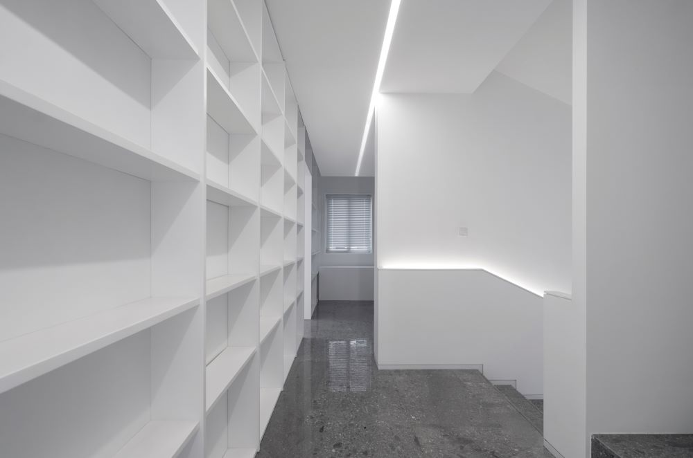
三层·资料室 Third floor · Reference Room
叙事性空间
Narrative Space
空间叙事
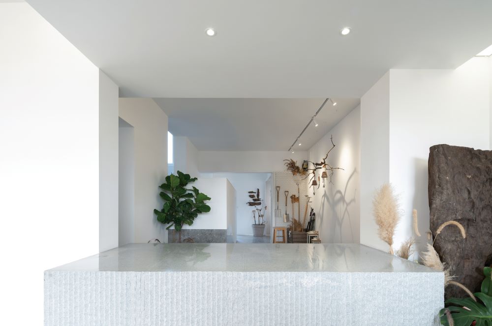
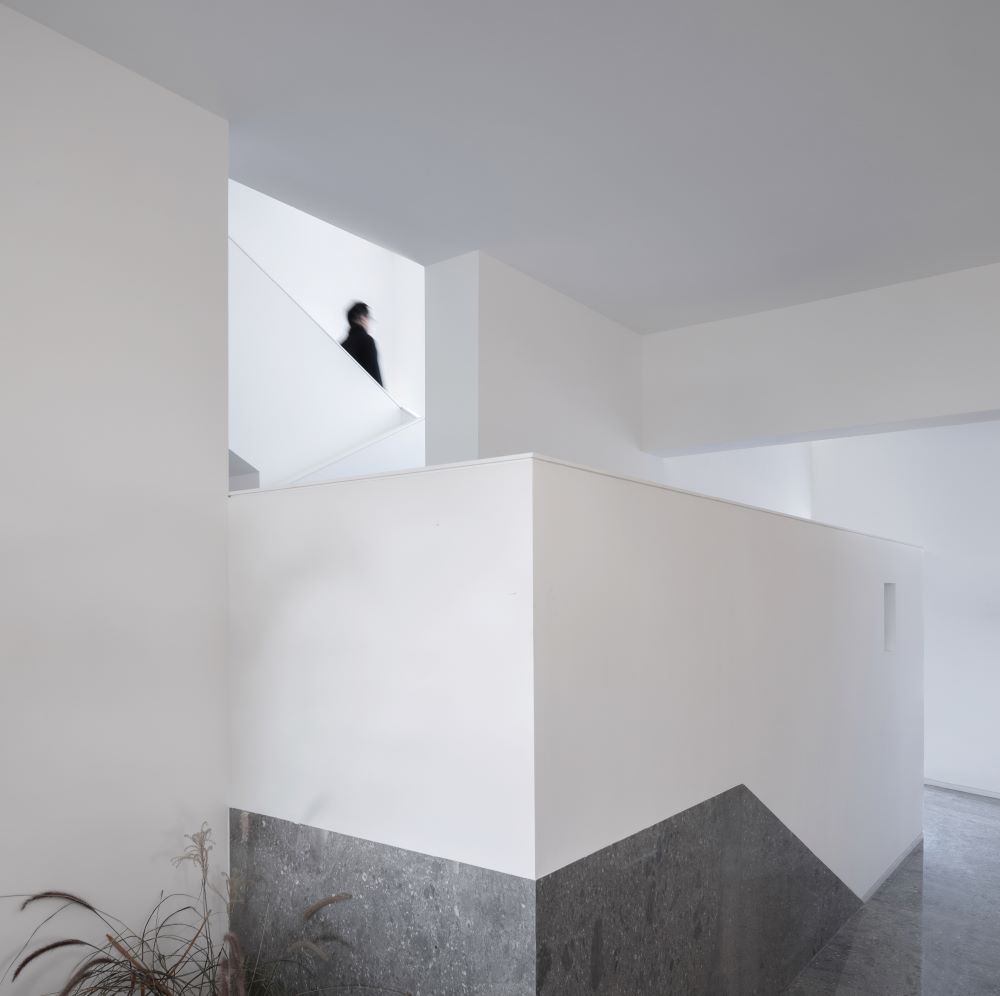
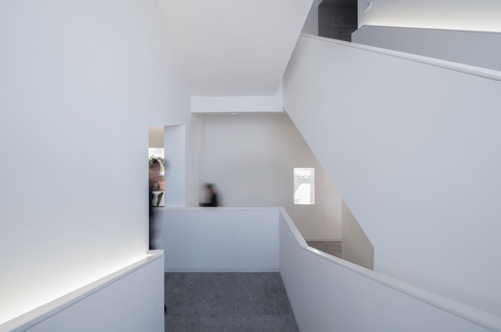
农民房的格局多为对称形态,楼梯间位于中央,在平面布局与流线上约束了展厅的开放性与秩序感。在有限的空间内,连贯的展览序列是最为理想舒适的观展体验,设计通过对局部门洞的梳理与楼梯间的改造,使得原本的对称刻板的空间变得流动与自由,入口展区条形吧台的设置同样重新组织了展览流线,使得人们一入展馆,便踏入了园艺工具历史叙述性的时间线,随之进行浏览与体验。
The layout of farmers' houses is mostly symmetrical, with the staircase located in the center, which constrains the openness and sense of order of the exhibition hall in terms of plane layout and flow lines. In a limited space, a coherent exhibition sequence is the most ideal and comfortable viewing experience. Through the sorting of the door holes and the renovation of the stairwells, the original symmetrical and rigid space becomes fluid and free. The setting of the bar counter at the entrance exhibition area has also reorganized the exhibition flow, allowing people to step into the historical narrative time line of gardening tools as soon as they enter the exhibition hall, and then browse and experience it.
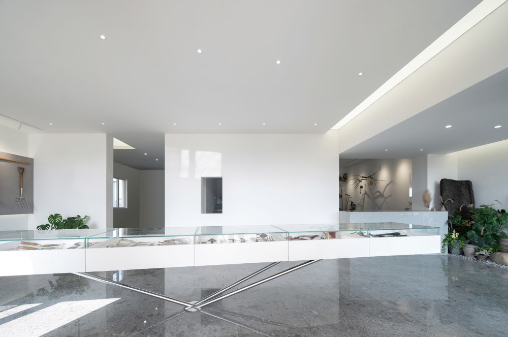
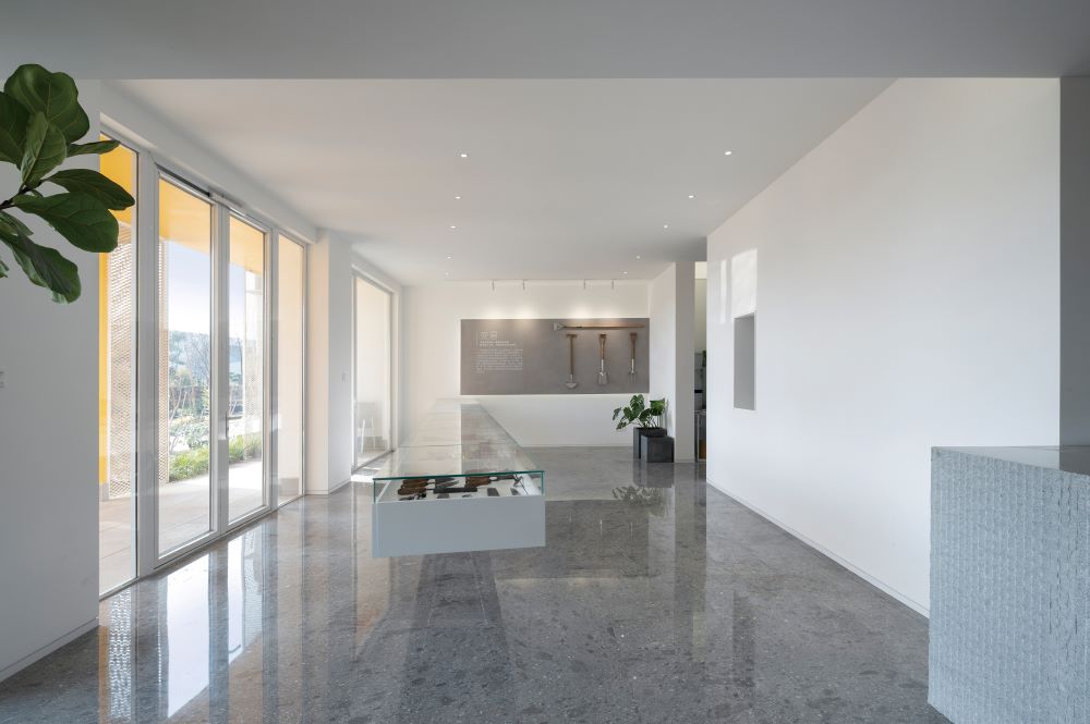
入口处的展台划分了空间并引导了游览路径
The Showcase at the Entrance Divides the Space and Guides the Tour Path
洞口中的层次
The Hierarchy in the Hole
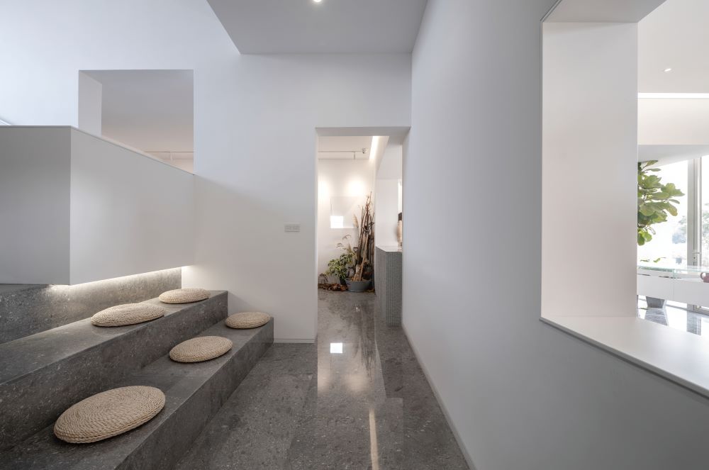
原封闭的楼梯间变为展览区的一部分
The originally enclosed staircase has been transformed into a part of the exhibition area
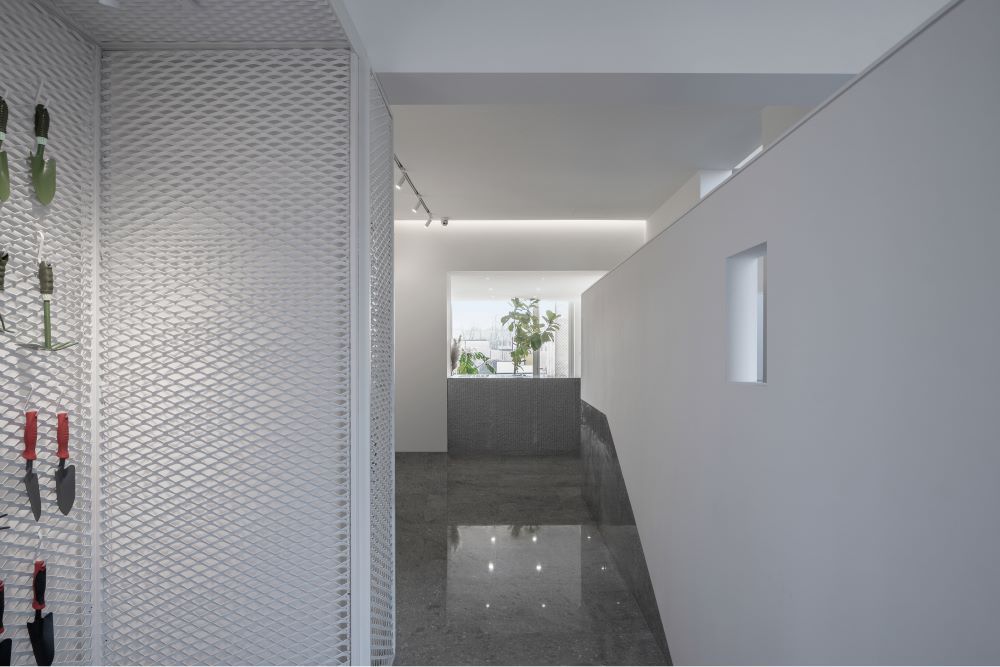
行进中的展览体验
Exhibition Experience in Progress
楼梯间的改造是空间格局重整的重点,既梳理了观展流线,也加强了空间的纵深感。回折的路径打破了封闭独立的空间,令原本作为交通功能使用的区域具备了展示功能,并丰富了展览的体验感。
The renovation of the stairwell is a key focus of spatial layout reorganization, which not only streamlines the exhibition flow, but also enhances the sense of depth in the space.The folding path breaks the closed and independent space, giving the area originally used as a transportation function a display function and enriching the exhibition experience.

小园林
Small Garden
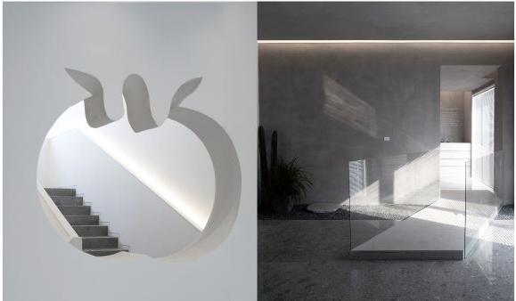
截取园林中的元素,营造园圃的意趣
Extracting elements from the garden to create its charm
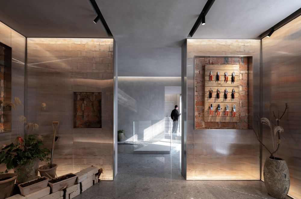
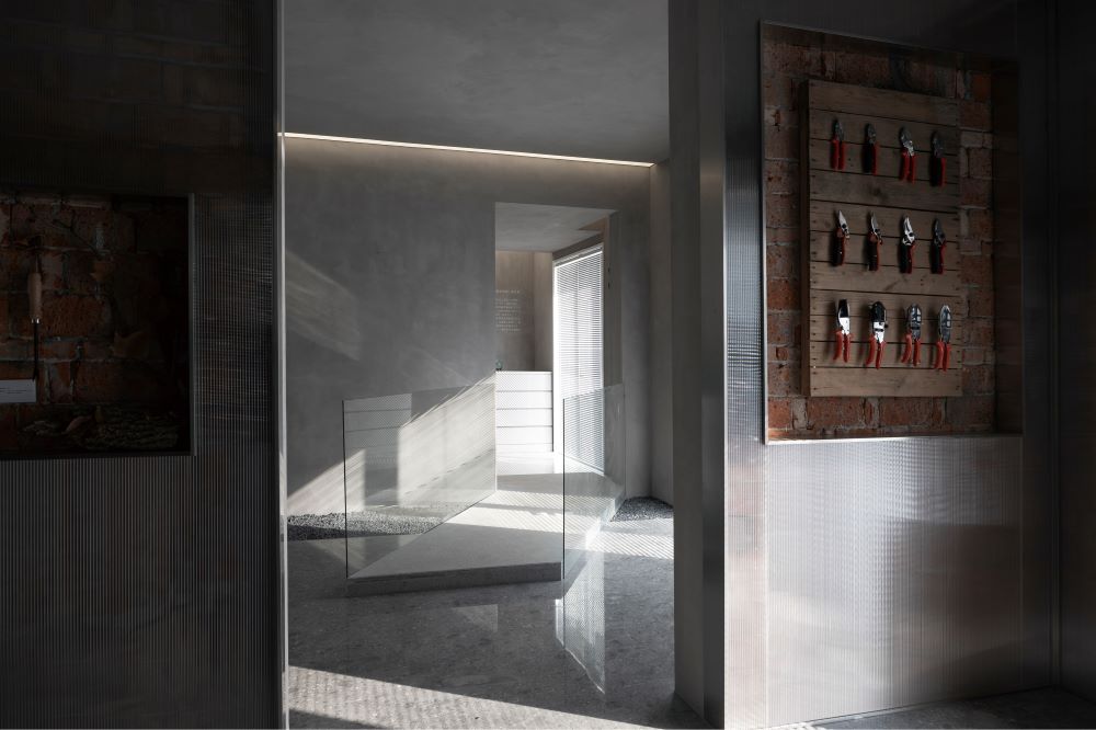
中国自古就有园艺产业,自秦汉开始便有了设施园艺的记载,万历年间的《花史左编》中更明确记录了古时民间园艺工具的繁复精细:花剪、木杓、蚌壳、种刀等二十余种器具的列举均体现了明代文人之于园圃中的生活。传统展区尝试提取一小段园林元素作为空间的结构,试图将花窗、旱溪、桥与亭进行有序的搭接,营造出园圃中的手作感,成为游览时间线上的节奏变化。相比现代展区,这里运用了更具质感的材料:墙体裸露的老砖、园圃常用的阳光板、抹泥与灰泥塑造的墙面都提供了场景化的观展感受。
China has had a horticultural industry since ancient times, with records of facility horticulture dating back to the Qin and Han dynasties. The "Left Compilation of Flower History" during the Wanli period clearly documented the intricate and refined nature of folk horticultural tools in ancient times, including flower shears, wooden spoons, clam shells, and planting knives. The list of more than 20 types of tools reflects the life of Ming literati in gardens. The traditional exhibition area attempts to extract a small piece of garden elements as the spatial structure, attempting to orderly overlap flower windows, dry streams, bridges, and pavilions, creating a handmade feeling in the garden and becoming a rhythm change on the travel time line. Compared to modern exhibition areas, more textured materials are used here: exposed old bricks on the walls, commonly used sun panels in the garden, and walls shaped with mud and plaster, all providing a scene based viewing experience.

“入园” Entering the Garden
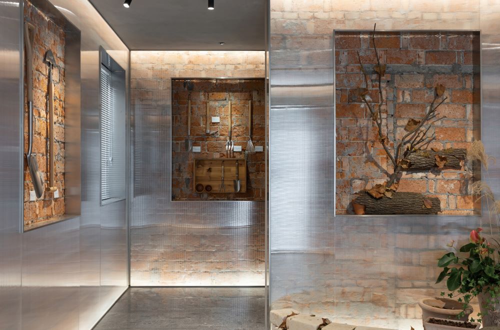
斑驳的原墙面与园艺中常用的材料
The mottled original wall surface and commonly used materials in gardening
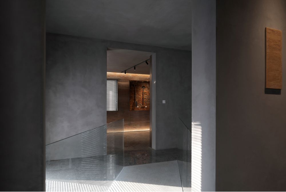
“桥”的指引
Guidelines of the Bridge

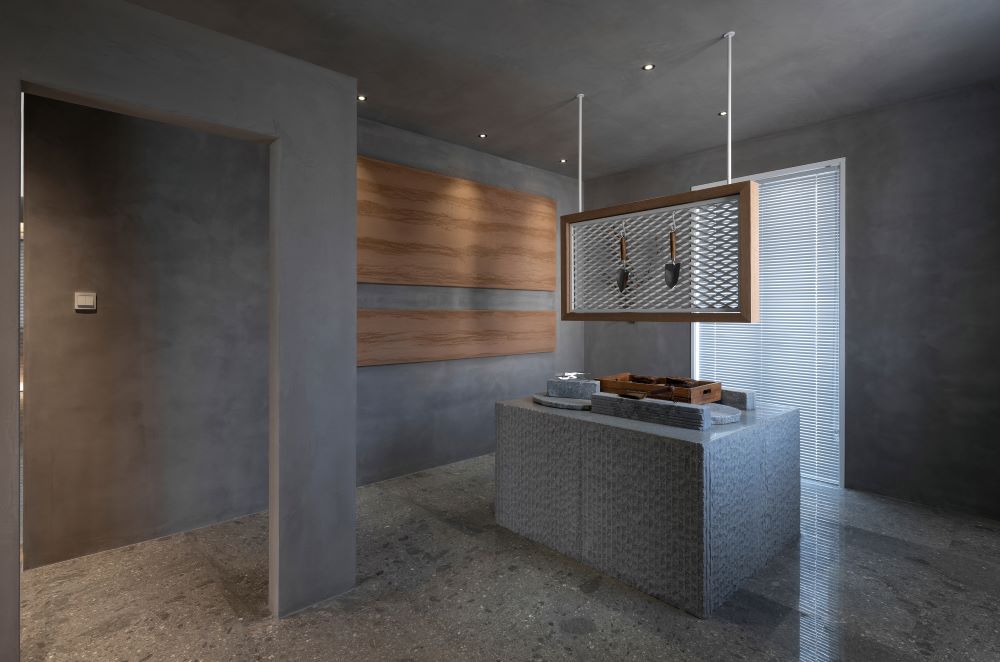
石材、抹泥、灰泥营造自然感
Stone, plastering, and plaster create a natural feeling
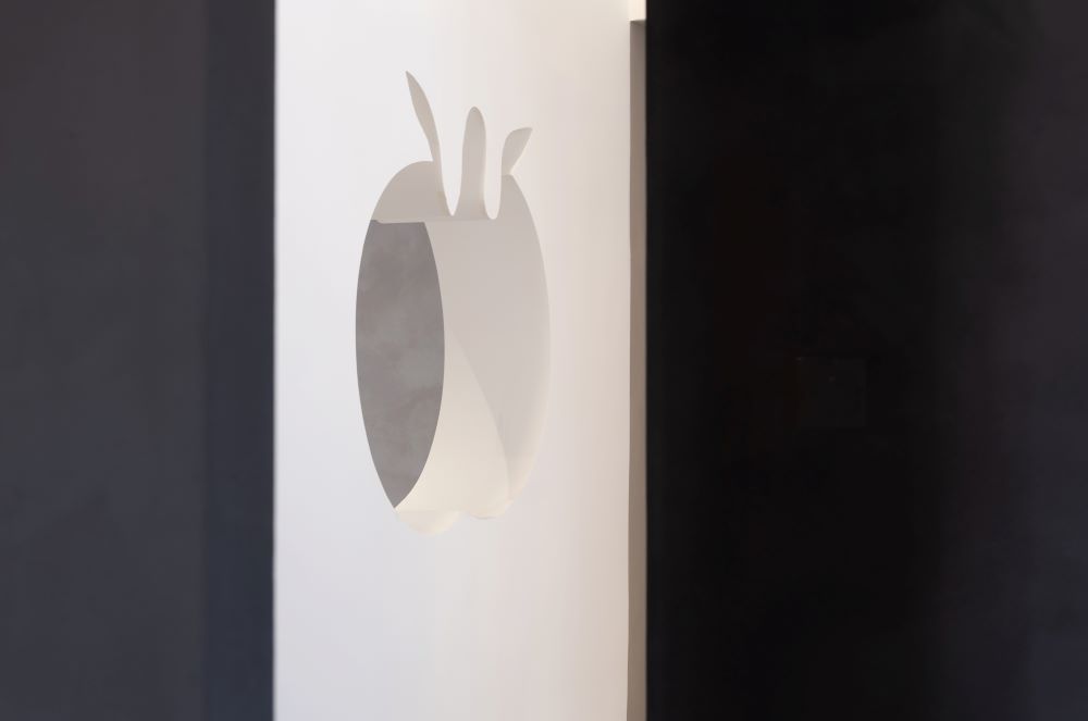
出展厅,又见“石榴”窗
"Pomegranate" window can been seen again when leave the exhibition
有空间序列,有曲折萦绕,游径中的展厅各有姿态,光线有别,明暗不一。不同的材料创建的空间容纳不同种类与年代的园艺工具展品,营造出传统园圃与现代花园的差异性与历史的交融,几百方的展厅便有了时代感,有了故事性。
There is a spatial sequence, with twists and turns lingering around, and each exhibition hall in the path has its own posture, with different lighting and brightness. The space created by different materials accommodates horticultural tools and exhibits of different types and eras, creating a blend of differences and history between traditional and modern gardens. Then, the hundreds of square exhibition halls have a sense of the times and storytelling.
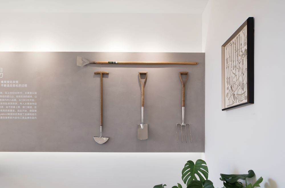
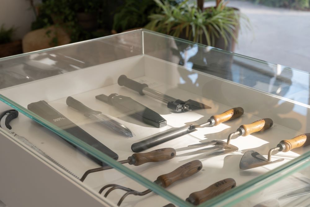
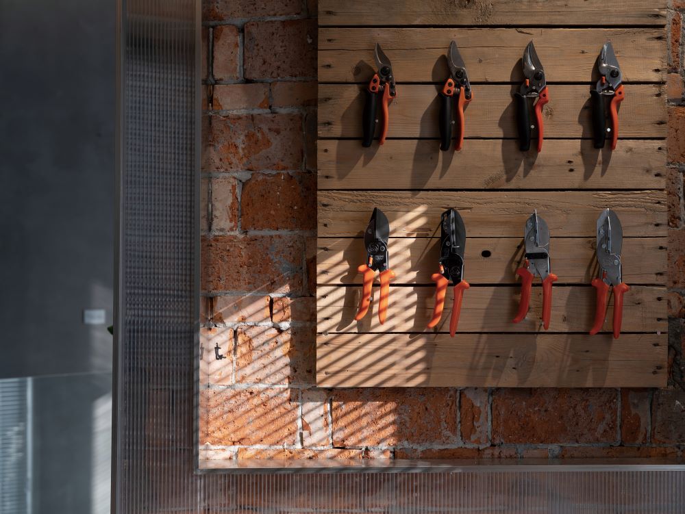
工具展览 Tool Exhibition
相关图纸
Drawings
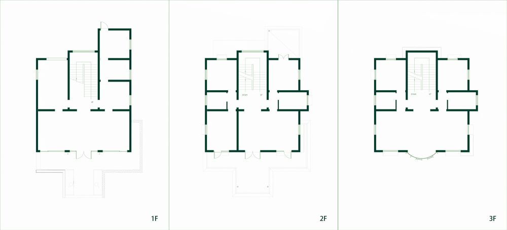
改建后的平面变化
Plan changes after renovation
项目信息
项目名称:园艺的故事——园丁工具博物馆
项目类型:室内设计
设计方:森上建筑
公司网站:www.sens-arch.com
联系邮箱:senshang@qq.com
项目设计:2021.12
完成年份:2023.09
设计团队:章钧添 孙鸿斐 王鑫 欧阳丹
项目地址:浙江海宁
建筑面积:400㎡
摄影版权:邱日培
合作方:-
客户:虹越花卉股份有限公司
材料:艺术涂料、石材、钢板网、阳光板
品牌:-
Project name:The Story of Gardening - Gardener's Tool Museum
Project type:Interior design
Design:Sens Architects
Website:www.sens-arch.com
Contact e-mail:senshang@qq.com
Design year:2021.12
Completion Year:2023.09
Leader designer & Team: Zhang Juntian,Sun Hongfei
Project location:Zhejiang ,Haining
Gross built area: 400㎡
Photo credit: Qiu Ripei
Partner:-
Clients:Zhejiang Hongyue Seed Co., Ltd
Materials:Art paint, Stone, Expanded metal mesh,Polycarbonate sheet
Brands:-
发文编辑/网站审核|吴秀秀
版权©建道筑格ArchiDogs,转载请联系media@archidogs.com
若有涉及任何版权问题,请联系media@archidogs.com,我们将尽快妥善处理。

